GlobalGiving
When I joined the team at GlobalGiving in 2014, the nonprofit crowdfunding website hadn’t had a designer on the team for over five years. Redesigning, shaping, cultivating, building, protecting, and maintaining the GlobalGiving brand is, by far, the biggest project I’ve ever done and I’m incredibly proud of what we’ve made with very limited resources.

Starting from scratch
Redesigning a website of this size was no small task. The old site was not mobile friendly, and was very cluttered. I was responsible for creating a simple, functional homepage with a small team that would showcase featured projects from our nonprofit partners and direct our users quickly and easily to the information they needed.

The logo refresh
The logo that was used since 2004 that didn’t match the technology-first, young, cutting edge, personable vibe of the organization. It also didn’t reduce well and had thin serifs that got lost on mobile screens. I kept the logo icon to retain the brand recognition that had been built, and gave it a new typeface, which I customized for us, and brightened the color palette.

A new checkout to increase conversions
Previously, the checkout process to make a simple donation on our site required the user to slog through five screens of questions and steps before they converted. We asked for too much unnecessary information, like the donor’s address and phone number, which created friction and caused many abandoned carts. In the redesign of this flow, we asked for as little information as possible and carefully considered the purpose and necessity of every single element on this one screen. Since the launch of our new checkout, we have seen a steady increase in conversions and have had an outpouring of positive feedback from our global users.

Building a new dashboard
In 2017, our small UX team shifted our audience focus from our donors to our nonprofit leaders that use our site on a daily basis. We completely overhauled their dashboard, which is now much clearer and more organized. The layout is modular and flexible so that it can grow with the organization and be added to without getting too cluttered. The design was born out of user research and interviews we conducted in which we asked our nonprofit leaders what information they looked for most often and what they wanted to be most accessible at a glance.

Prioritizing our disaster work
After the major disasters of late 2017, we wanted to showcase and prioritize our disaster relief work on the site. We raised tens of millions of dollars for organizations responding to Hurricanes Harvey, Maria, and Irma—a significant portion of which came from corporate partners and celebrities. Most recently, we built a new template for our disaster “fund” pages, which can grow with a disaster. From the minute a disaster strikes, this templated page will go live with only the basic information donors need. As time goes on, we can add various modules, reports, statistics, maps, projects, and updated information to give our users a complete picture of the impact that has been made.

Making an impact with video
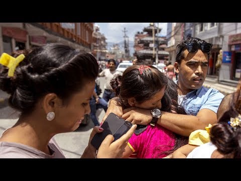
Because I have a background in video editing, I am able to create a more complete experience for our audiences through short storytelling videos. This video gives the audience a glimpse into how and why we do our disaster relief work. Our storytelling focuses on people expressing their thoughts in their own words, and portraying situations accurately and with respect.

Searching for projects
With thousands of projects on our website for donors to choose from, browsing our site can be overwhelming. I worked with our front-end and full stack developers to make a completely new search system—one that would make finding the perfect project easier, faster, intuitive and fun. We eliminated extraneous elements and only kept the bare minimum information users might need to choose the project they like best.

Respect, empathy, and dignity
One of the most important parts of my job at GlobalGiving, and perhaps my highest responsibility, has been curating our repository of images. All photos used on our website and in our collateral has been uploaded by the nonprofits we serve. From this collection, I choose only the best to represent GlobalGiving. I am incredibly proud of the brand we have built, and our prioritization of choosing images that convey people with the utmost dignity. Many nonprofits still use pity to appeal to their audience, which damages public perception of what these people’s lives are really like.
I have written extensive Guidelines for Ethical Photo Usage, as well as tips on Choosing Ethical Photos for Nonprofit Fundraising. This is a topic I care deeply about, and strive to be better at every day.

Diversity and Equity
I set out to create a set of illustrated people that could represent our GlobalGiving community. While there are only eighteen characters here, and they cannot represent every type of person, I tried to create people that almost everyone could relate to. People of all colors, shapes, ages, backgrounds, locations, and abilities are shown in these simple and lighthearted illustrations, which we use for various marketing materials and graphics.

Consistency in Iconography
Over the years I have developed a strong icon style, which is used throughout the website and in our printed pieces. There are abstract concepts in our content—like partnerships, raising money, thought leadership, and success—which I’ve visualized through simple, clear icons.

Branding individual campaigns
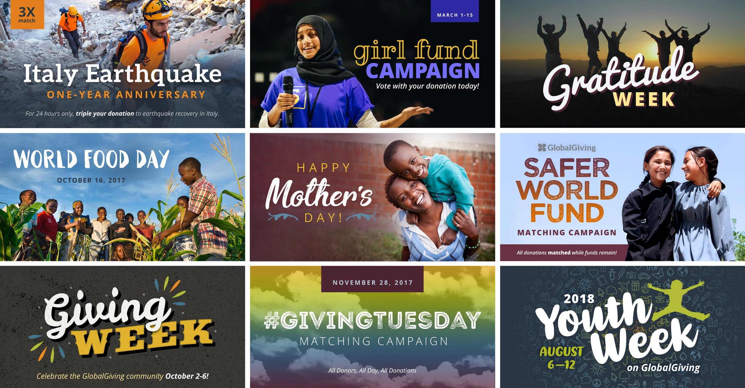
Throughout each year, GlobalGiving organizes and runs various campaigns to benefit the nonprofits we serve and help them raise funds. Each campaign has its own focus and theme, and my role is to give these campaigns their own visual sub brand. I get to be creative and break the mold of the main brand to create fun and fresh visuals that can be used by our nonprofit leaders to appeal to their own donor network. These campaign graphics help build excitement and drum up enthusiasm during the year’s big fundraising pushes.

